R그래프 살펴보기
아래의 구분을 입력한 뒤 엔터키를 눌러 R에서 제공하는 다양한 형태의 그래프를 살펴보세요
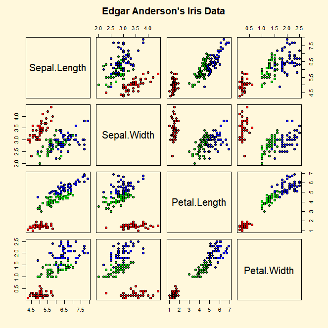
> demo(graphics);
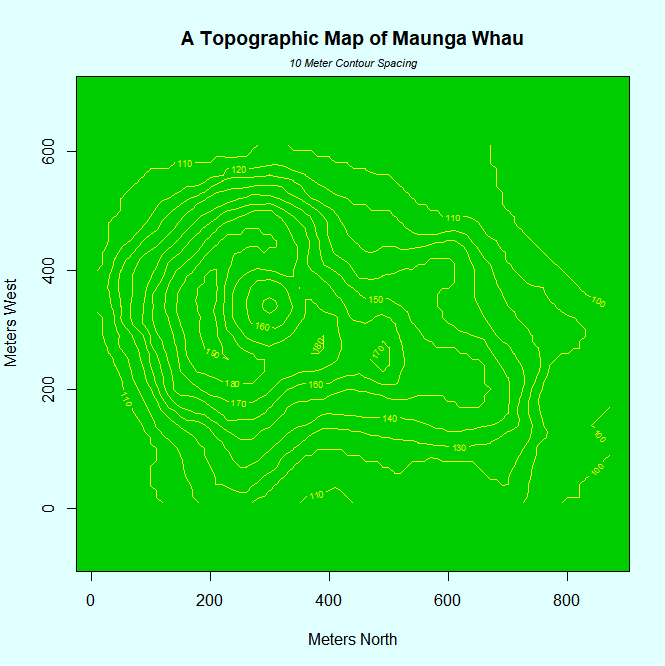
> demo(persp)
Plot 함수
지정하는 object들을 도표상에 표시하는 함수
> attach(mtcars) # 데이터 mtcars에 대한 함수구문 시작
> plot(wt,mpg) # x축 wt, y축 mpg로 하여 점 그래프 생성
> abline(lm(mpg~wt)) #mpg와 wt 사이의 상관관계(회귀분석) 선 그리기
> title("regression of MPG on Weight") #그래프 제목 넣기
plot 함수의 옵션
|
파라미터 |
option 설명 |
|
type = |
그래프의 형태를 지정 type='p' : 점(point) 그래프 type='l' : 선(line) 그래프 type='b' : 점끼리 선으로 이어진 그래프 type='o' : 선과 점이 겹쳐진 그래프 type='h' : 수직 막대 그래프(histogram) type='s' : 계단형 그래프 |
|
xlim= ylim= |
x축과 y축의 상한과 하한. xlim=c(1,10) or xlim = range(x) |
|
xlab= ylab= |
x축과 y축의 이름(label) |
|
main= |
그래프 위쪽에 놓이는 주제목(main title) |
|
sub= |
그래프 아래쪽에 놓이는 소제목(subtitle) |
|
bg= |
그래프의 배경 색깔 |
|
bty= |
그래프를 그리는 상자의 모양 </td |
|
pch= |
표시되는 점의 모양 |
|
lty= |
선의 종류 1: 실선(solid line), 2: 파선(dashed), 3: 점선(dotted), 4: dot-dash |
|
col= |
그래프에 표시될 항목의 색깔 지정: 'red','blue' 및 색상을 나타내는 숫자 |
|
mar= |
bottom, left, top, right의 순서로 가장자리의 여분 값을 지정. 디폴트는 c(5,4,4,2) + 0.1 |
|
asp= |
종횡의 비율 Apsect ratio (=y/x) |
|
las= |
0: 축과 평행[기본 옵션], 1: 가로, 2: 축과 직각, 3: 세로. |
pch 예시

lty 예시

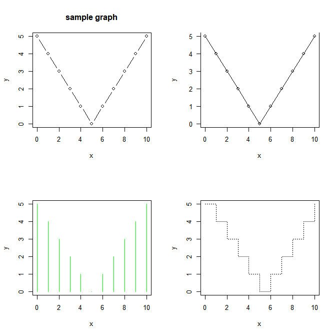
화면에 여러개의 plot 그래프 출력하기
> x<-c(0:10)
> y<-c(5,4,3,2,1,0,1,2,3,4,5)

> par(mfrow=c(2,2)) # 2x2의 배치로 4개의 그래프를 한 화면에 그림

> plot(x,y,type='b',main='sample graph')
> plot(x,y,type='o', las=1, bty='u')
> plot(x,y, type='h', col='green')
> plot(x,y, type='s', lty=3)
그래프 겹쳐그리기
abline() : 직선
- abline(a,b) : 절편 a, 기울기 b인 직선
- abline(h=y) : 수평선
- abline(v=x) : 수직선
- abline(lm(x~y)) : x와 y사이 회귀분석을 통해 나온 결과선
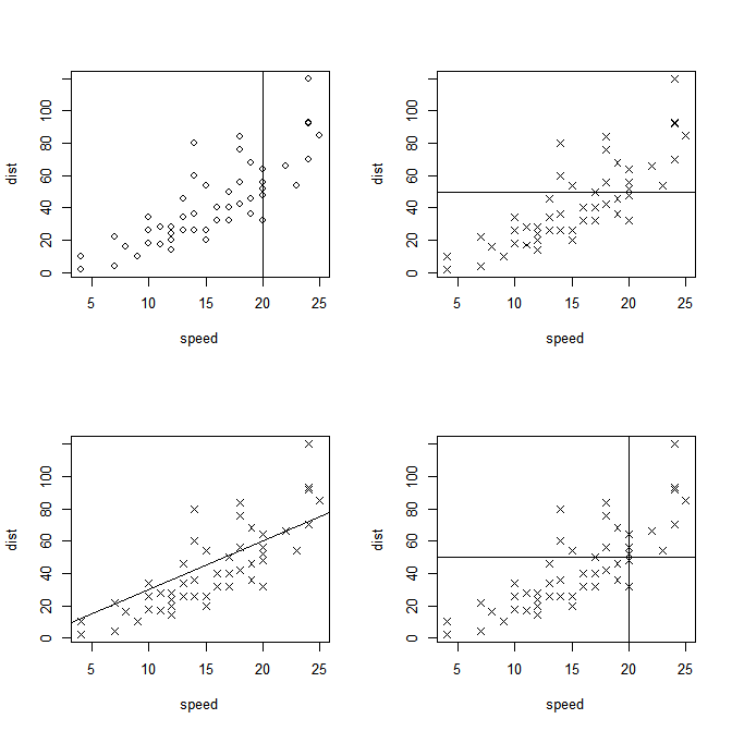
> data(cars)
> attach(cars)
> par(mfrow=c(2,2))
> plot(speed, dist, pch=1); abline(v=20)
> plot(speed, dist, pch=4); abline(h=50)
> plot(speed, dist, pch=4); abline(0,3)
> plot(speed, dist, pch=4); abline(h=50); abline(v=20)
점 그래프 boxplot
> dotchart(mtcars$mpg, labels=row.names(mtcars), cex=0.7, main='모델별 회발유 마일리지'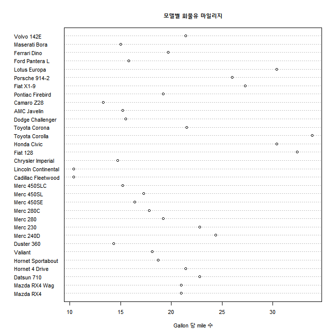
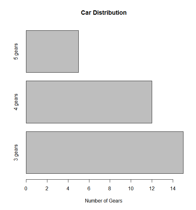
BarPlot (막대 그래프)
수직 막대 그래프
> barplot(table(mtcars$gear), main='Car Distribution',xlab='Number of Gears')
#table(mtcars$gear)는 gear따라 데이터 값을 그룹화 하여 갯수를 세는 함수
#ex) gear 3는 5건, 4는 6건

수평 막대 그래프 (horiz = TRUE 옵션 부여, x축 항목별 이름 부과)
> barplot(table(mtcars$gear), main='Car Distribution',xlab='Number of Gears',horiz=TRUE, names.arg=c('3 gears','4 gears','5 gears'))
누적 막대 그래프 (stacked bar plot)
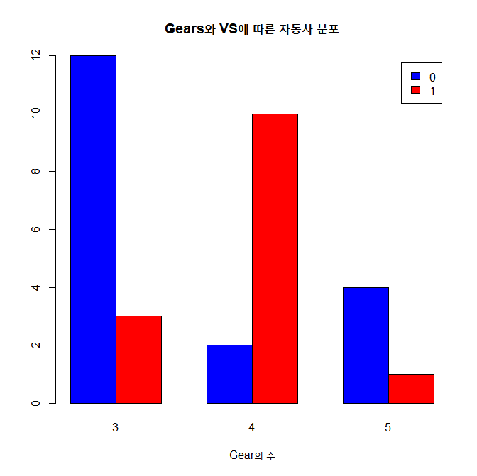
> counts <- table(mtcars$vs, mtcars$gear)
> counts

     3  4  5
  0 12  2  4
  1  3 10  1
> barplot(counts, main='Gear와 VS에 따른 자동차 분포',xlab='gear의 수',legend=rownames(counts))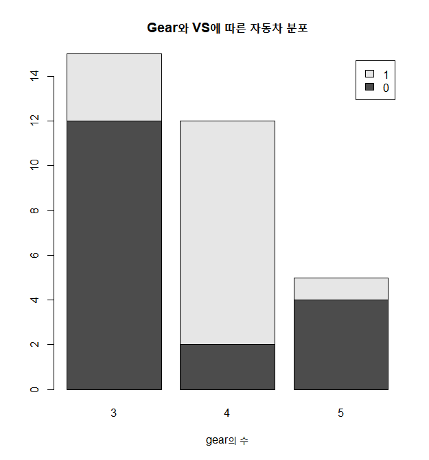
그룹 막대 그래프
> barplot(counts, main='Gears와 VS에 따른 자동차 분포',
+ xlab='Gear의 수',col=c('blue','red'),
+ legend=rownames(counts),beside=TRUE)
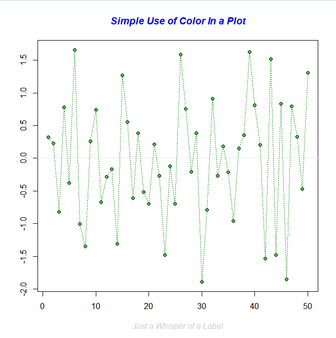
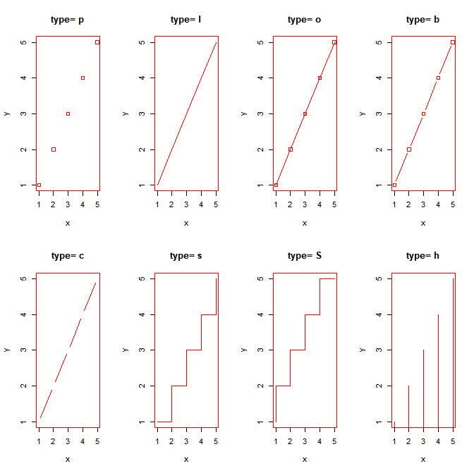
선 그래프(Line Charts)
lines(x,y,type=)
- x와 y는 vector
- type은 다양한 값을 가짐
- p : 점
- l : 선
- o : 점과 선 겹쳐서
- b,c : 선으로 연결된 점들 (b는 채워진 점, c는 비워진 점)
- s S : 계단형
- h : 선으로 그려진 막대그래프
- n : 아무것도 출력하지 않음
>#line 그래프 type 별로 출력해보기
> x<-c(1:5)
> y <-c(1:5)
> par(mfrow=c(2,4))
> par(pch=22, col='red')
> opts = c('p','l','o','b','c','s','S','h')
> for(i in 1:length(opts)){
+ heading = paste('type=', opts[i])
+ plot(x,y,type='n',main=heading)
+ lines(x,y,type=opts[i])
+ }
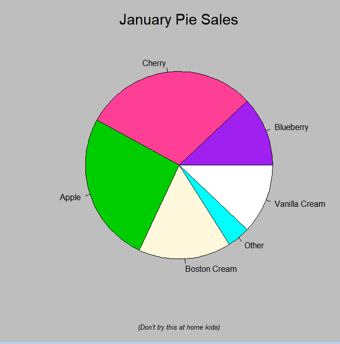
파이 차트 (원그래프)
pie(x, labels='')
- x의 값은 원 조각의 면적으로 표기
- labels는 각 원 조각의 이름
> slices <- c(1:5)
> sliceLabels <- c('A','B','C','D','E')
> pie(slices, labels=sliceLabels, main='Samples')

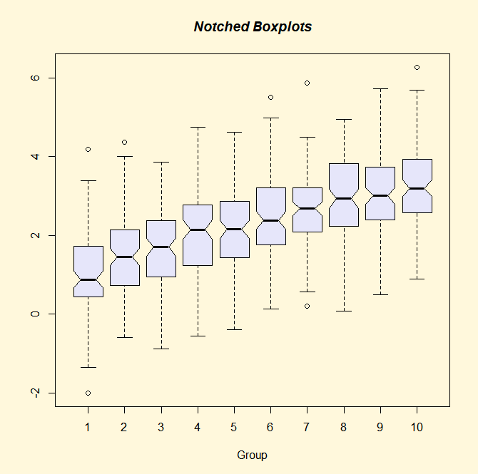
상자 그래프 (Box Plot)
- box-and-whisker plot - 최대값, 중앙값, 최소값, Q1(1분위수), Q3(3분위수)
- 각 변수별 또는 그룹별로 boxplot이 가능
- boxplot(x,data=)
- x는 formula, data=에서 데이터프레임 지정
- formula(예 : y~group, group에 따라 y는 어떻게 변화하는가?)
- horizontal=TRUE -> 축방향이 반대
> attach(mtcars)
> boxplot(mpg~cyl, data=mtcars, main='자동차 milage 데이터',
+ xlab='Cylinder 수',ylab='Miles Per Gallan')
> detach(mtcars)

산점도(scatter plot)
두 변수 값을 좌표평문에 표시해서 변수 간의 관련성을 보여줌
plot(x,y)
plot(mtcars$wt, mtcars$mpg)